top

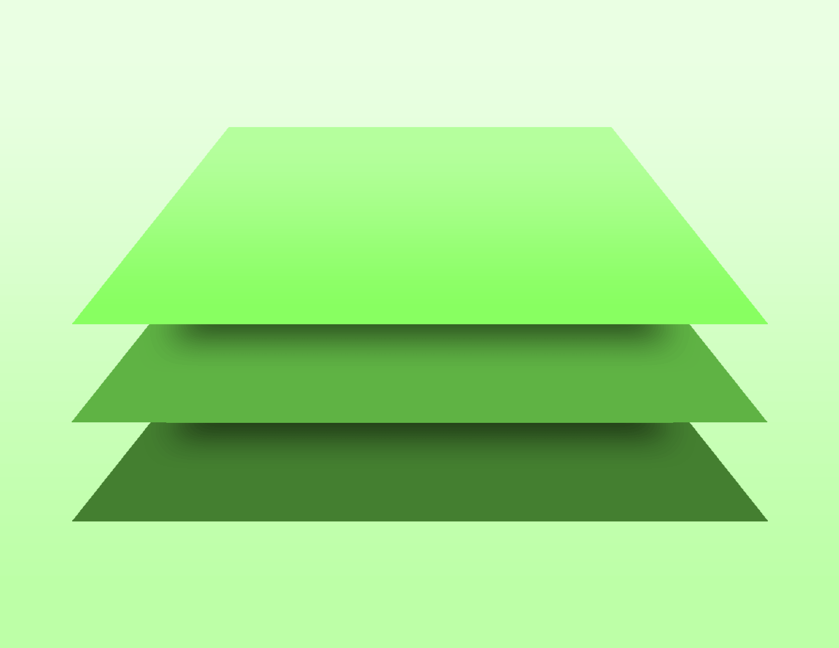
The future of design starts with a single notion that user experience should be consistent over multiple platforms. Created by Google in 2014, this new way of design was a completely different way of thinking than the flat design style used before. Using real-life concepts of paper, Google had taken that idea and implemented it into the digital world. This breakthrough opened a whole new world of possibilities in design for years to come. Concepts of paper stacking and ink on paper lead to paper based designs that can use multiple elements of a web page to show hierarchy. When these ideas are put into play, they create an environment that is all too well known to users. The familiarity of a piece of paper that’s translated into digital form also translates understanding of form to a user. Importantly, that familiarity brings a more interactivity between the website and the user, causing a more successful website in the end.

The idea is to create components in the web that behave similarly to real-life objects. This way, designers are able to eliminate ambiguity and maximize predictability, creating a better user experience and a more ambitious design altogether. However, there is more that can be added to the implementation of the web. These paper elements within the design style aren’t static like a real piece of paper for example. A regular piece of paper has a set proportion, color, and weight. With the web, these elements can stretch and shrink, grow and contract, light up or dim. The real possibilities are endless. With this liquidity found in the design elements, a more versatile webpage can be created.
So with these ideas in mind, the main question is how exactly do we represent these material aspects within a digital realm? There are many different paths a designer could take to add Material Design to their page. To read more about these strategies, you can look at the page linked here.
Material design on the surface seems straightforward, the idea is to replicate real-life material, but with all of the different areas of it there is more to it than it seems. There are so many different aspects that require mastery to properly convey the essence of material design. When there is no connection between a button and the mouse clicking it, then there is no true identity of material design. But when used correctly, users find it easier to navigate and feel intune with a web page.
References: