top

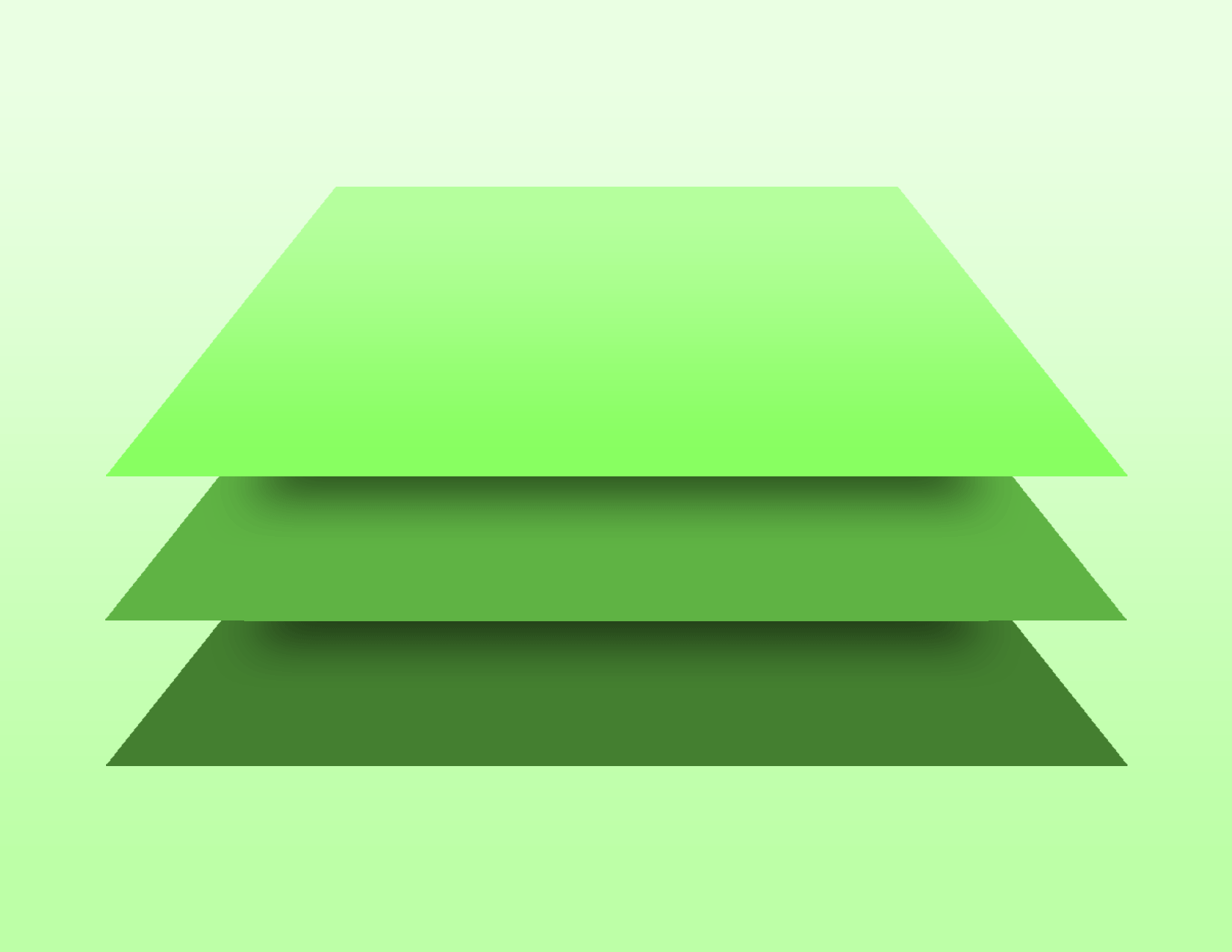
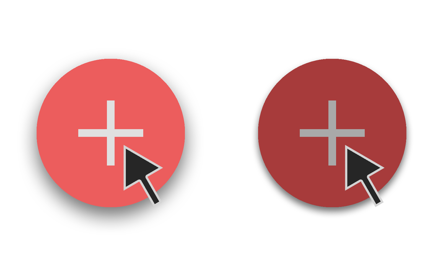
One really important concept to this is of course the idea of the paper stacking, how do we show this on a flat piece of glass? Depth can be used to create the illusion of material. And to do this, a light source is implemented. Elements that are high up on the hierarchical scale will create a darker shadow that relays the idea of the element lifting off of the screen and stacking above the element below. Hence, the stacking of paper is duplicated into the digital realm. Color can be used to resemble a button on a web page. The bright color red can be dimmed down to a low maroon as a user presses it to lead them to their destination. Hierarchy is communicated through differences in font weight, size, letter spacing, and case in typography. A shape like a circle will stand out more against clear cut boxes to show it as a button rather than grouping individual circles together.

Now all of these ideas are nice but without a proper behavior from the elements, the design won’t truly feel like it is reminiscent of material. Take the red button for example, on the surface it stands out against a white background so the user gets a sense of its importance automatically. But the user goes to press it and it directs them to the destination and that’s that. Implement behavior and that red button turns maroon because of the click and the user understands it as a button more easily. Interaction should feel natural to the user, without that, it is less likely that the user will be in tune with the design and they will then feel disconnected.
With these strategies implemented, material design can be executed in web pages to produce a good user experience. Animation, color, typography, key lights, and shadow on graphic elements creates an important connection with the user that is important for a proper design. To return back to the main article, click here.
References: